
When it comes to building a website that performs well on all devices, business owners and marketers are often faced with a crucial decision: responsive or adaptive web design?
While both aim to optimize user experience across devices, they take very different approaches and understanding those differences is key to choosing the right strategy for your business.
In this guide, we’ll explore the differences between responsive and adaptive web design, break down their pros and cons, and help you decide which approach is better for your brand, especially if you’re looking for long-term growth, improved SEO, and a smooth user journey.
Responsive vs Adaptive Web Design
Before we dive into the pros and cons of each approach, it's essential to first understand what responsive and adaptive web design actually mean — and how they function behind the scenes. By getting clear on the basics, you’ll be in a better position to evaluate which design strategy aligns best with your business goals, technical needs, and user expectations. If you're also wondering how to start an E-commerce business in Dubai, both responsive and adaptive designs can play a key role in delivering a smooth, optimized experience for your customers, helping you establish a strong online presence from the start.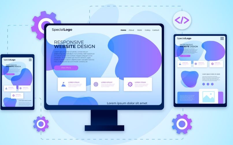
Definition and Key Differences
Responsive web design uses flexible grids, fluid layouts, and media queries to automatically adjust the website’s content and design to fit any screen size — whether it’s a smartphone, tablet, laptop, or desktop. There’s one single layout that adapts dynamically. Adaptive web design, on the other hand, involves creating multiple fixed layouts for different screen sizes. When a user visits your site, the server detects their device and loads the layout that fits best (e.g., one for desktop, one for tablet, one for mobile). Key difference: - Responsive = one layout that adjusts fluidly - Adaptive = multiple layouts pre-designed for specific devicesPros and Cons of Responsive Design
Pros: - One single website to maintain - Better for SEO (Google recommends it) - Easier to implement with modern frameworks - More cost-effective in the long run Cons: - Can be slower on mobile if not optimized - Design flexibility is limited across screen sizes - Complex layouts may not render perfectly on all devices without custom tweaksPros and Cons of Adaptive Design
Pros: - Offers more control over how your site appears on different devices - Can load faster by serving only what’s needed per device - Better for highly customized or content-heavy websites (e.g., complex product pages) Cons: - Requires designing and maintaining multiple versions - Higher upfront cost and ongoing maintenance - Not ideal for rapidly changing content or large-scale websites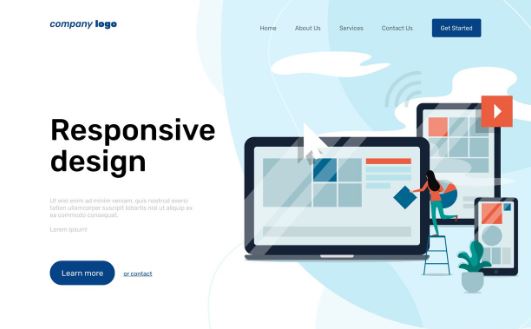
Comparing Responsive and Adaptive Web Design
So which one should you choose for your website or project? The answer depends on your goals, audience behavior, budget, and available resources. At HDM, we help businesses across the UAE stand out with effective web design tailored to their needs and growth goals. Let’s compare the two based on what matters most:Impact on User Experience
Responsive design provides a more fluid and consistent experience across devices, especially for websites with content that’s updated regularly. Visitors get the same look and feel, no matter the screen size, which builds familiarity and trust. Adaptive design can offer a tailored experience for each device, which is great for high performance apps or custom flows. But if a user switches devices, they may see a different interface which could lead to inconsistency in brand perception.Performance Considerations
Adaptive websites often load faster because they only serve the layout and assets needed for the detected device. However, this depends heavily on how well the site is built and optimized. Responsive websites can load slightly slower if they serve large assets across all devices but with modern tools like image compression, lazy loading, and performance plugins, this gap is closing fast. In both cases, speed optimization should be part of your web design service plan.SEO Implications of Responsive and Adaptive Design
From an SEO perspective, responsive design is generally preferred. Google has publicly recommended responsive over adaptive because it simplifies crawling, indexing, and ranking. One URL = stronger domain authority and cleaner analytics. Adaptive sites may create multiple versions or duplicate content issues if not implemented properly, which can negatively impact your search rankings. For any SEO strategy to succeed, especially in competitive regions like the UAE, having a mobile-friendly, fast, and crawlable site is essential. Discover how we approach SEO to drive real results.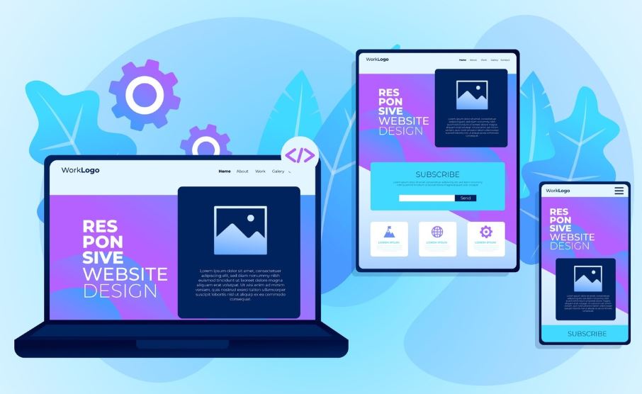
Final Thoughts: Which One Should You Choose?
If you’re a small to mid-sized business looking for a cost-effective, scalable, and SEO-friendly solution, responsive design is your best bet. It’s easier to maintain, works across all devices, and provides a consistent experience that keeps users engaged. Adaptive design is a better fit if your site has highly custom user experiences, specific technical requirements, or if performance on certain devices is your top priority. At HDM, we tailor every project based on your exact business needs. Whether you choose responsive or adaptive, we’ll help you design a site that performs beautifully across every screen and for every user.Frequently Asked Questions
- Can I combine responsive and adaptive techniques in one website? Yes. This hybrid approach is often called "RESS" (Responsive + Server Side). It uses responsive layout techniques but allows server-side logic to load different content or features based on device.
- Which design approach is more future-proof? Responsive design tends to be more scalable and adaptable to future devices and screen sizes, which makes it a safer long-term investment for most businesses.
- Do I need a different content strategy for responsive and adaptive designs? Generally no — but adaptive design may require more planning, especially if certain content appears or behaves differently across device layouts.
- How does responsive design affect loading speed on mobile? Poorly optimized responsive sites can be heavy, but with proper techniques like image compression and mobile-first design, you can achieve excellent speed and performance.
- Which is better for SEO: responsive or adaptive design? Responsive design is better for SEO. Google prefers it due to a single URL structure, easier indexing, and consistent user experience across devices.
- What’s the best option for e-commerce sites? Responsive design is often preferred for e-commerce because it offers a unified experience and is easier to manage. However, adaptive might be suitable for high-end, custom e-commerce flows where performance is critical.
- Is it possible to switch from adaptive to responsive design later? Yes — and many businesses do exactly that. While adaptive design can work well short-term, switching to a responsive layout allows for easier maintenance, better SEO, and improved scalability. A professional web design team can migrate your structure smoothly without losing content or functionality.
- Which design type works better for multilingual or right-to-left websites? Responsive design tends to handle multilingual or RTL (Right-to-Left) languages like Arabic or Hebrew more efficiently. It allows flexible layout adjustments without the need to create separate versions for each language — making it ideal for businesses in diverse markets like the UAE.