
your website is no longer just a static brochure, it’s your primary brand touchpoint. But with users visiting your site from dozens of different devices, from iPhones and Androids to tablets and 4K monitors, how do you ensure a consistent and professional experience?
That’s where responsive web design comes in. If you’ve ever wondered what is responsive web design and why is it important, you’re in the right place. This guide will explain everything from its definition to real business benefits, including how it affects SEO, cost, and mobile engagement.
Responsive Web Design Explained: Definition, Features & Website Pricing Factors
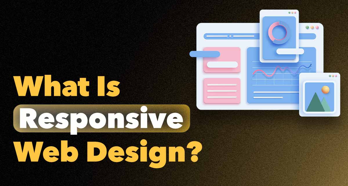
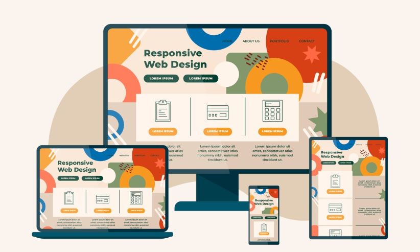
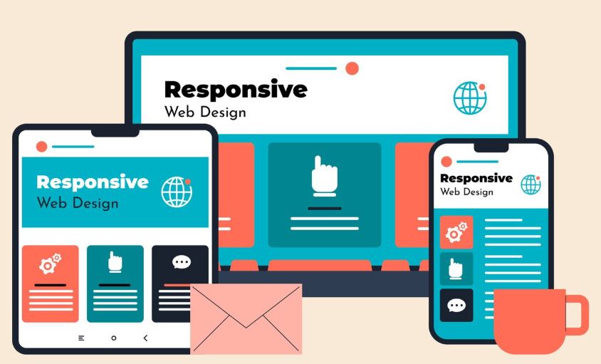
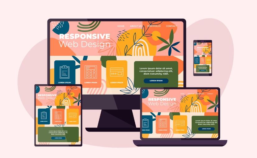
Responsive web design is a method of creating websites that automatically adjust to different screen sizes and devices. Whether your visitors access your site from a smartphone, tablet, or desktop, responsive design ensures that content looks clean, structured, and easy to navigate.
From a business standpoint, it’s also a major factor in website design pricing, because opting for a responsive solution typically eliminates the need for a separate mobile site.
What Is Responsive Web Design in Web Development?
Responsive web design (RWD) is an approach to web development that uses flexible layouts, fluid grids, and CSS media queries to adapt the structure of a website dynamically. Instead of building multiple sites for different screen sizes, responsive design adjusts a single layout in real-time.
It’s based on the principle of designing for the user, no matter what device they’re using. This means no horizontal scrolling, no pinching to zoom, and no missing buttons on smaller screens.
Key Features of Responsive Web Design
- Fluid Grids: Layouts are built on proportional values instead of fixed pixels. This allows the site to expand or shrink based on screen size.
- Flexible Images and Media: Images scale within their containing elements to prevent overflow or distortion.
- CSS Media Queries: These allow specific styles to be applied depending on the device’s width, height, resolution, and orientation.
- Consistent Navigation: Menus and interactive elements are adapted to remain user-friendly on both desktop and mobile.
- Mobile-First Design Philosophy: Modern responsive sites are designed starting from the smallest screen up ensuring the core experience works everywhere.
What Is the Purpose of Responsive Web Design?
The primary goal of responsive web design is to deliver a seamless and optimized user experience across all devices. But that purpose extends far beyond technical adaptability. Let’s break it down:
- Enhance accessibility and usability.
- Support diverse user behavior (mobile-first trends)
- Improve performance and loading times.
- Strengthen SEO rankings
- Reduce development and maintenance costs.
Put simply, responsive web design aligns your website with how people browse today and how they’ll continue to browse tomorrow.
Why Is Responsive Web Design Important?
Increasing Mobile Traffic and Engagement
Today, more than 60% of global internet traffic comes from mobile devices. If your website isn’t responsive, you’re likely losing valuable visitors before they even engage.
A responsive design ensures mobile users get fast-loading pages, legible content, and touch-friendly buttons. This improves dwell time, reduces bounce rates, and boosts lead generation. All of this information is from the device your audience is already using.
Impact on SEO and Search Rankings
Google has officially adopted mobile-first indexing, meaning the mobile version of your site is what’s primarily used for ranking and indexing. If your website isn’t mobile-friendly, your search rankings will suffer.
Responsive design is Google’s recommended approach, as it makes crawling and indexing simpler. With one URL, one set of content, and one responsive layout, it’s easier for both users and search engines.
Want to improve your search visibility in the UAE? Explore our SEO services.(link)
Cost Efficiency Compared to Separate Mobile Sites
Before responsive design became standard, many businesses built separate mobile versions of their websites. This meant double the work, double the updates, and often, double the cost.
How Does Responsive Web Design Work?
Responsive websites are built using HTML and CSS, with layout structures that are flexible instead of fixed. These layouts use relative units (like percentages) instead of absolute ones (like pixels), allowing them to stretch or shrink based on the screen.
CSS media queries play a critical role. They apply different style rules depending on the device’s width and orientation. For example, you might show a full navigation bar on a desktop and a hamburger menu on mobile, all from the same codebase.
Some key techniques used:
- Flexible containers that wrap content and scale with screen width
- Viewport meta tags to control layout rendering on mobile
- Breakpoints that define how and when layout shifts (e.g., at 768px, 1024px, etc.)
Together, these methods ensure that your website adapts instantly with no reloads, no redirects, and no separate URLs.
Final Thoughts: Why Your Website Needs to Be Responsive Today
Responsive web design isn’t just a development trend, it’s the foundation of a successful digital strategy. Whether your business is based in Dubai or serves customers globally, your website must be accessible, fast, and mobile-ready.
At HDM, we provide custom-designed responsive websites that look stunning and perform even better. Our approach is rooted in UX design, SEO strategy, and business growth, not just visuals.
We understand that your website is more than just a collection of pages, it’s your digital storefront. And in today’s competitive market, you can’t afford to fall behind.
Talk to HDM today for expert responsive web design services that help your brand stand out on any screen.
Responsive Web Design: Frequently Asked Questions (FAQ)
- What is responsive web design in simple terms?
It’s a way of designing websites so they automatically adjust to look good on any screen — whether it’s a phone, tablet, or computer. - What is the main purpose of responsive web design?
To give users a smooth, optimized experience across all devices — while improving SEO, reducing costs, and increasing engagement. - How does responsive design compare to mobile-only websites?
Responsive sites adapt from one version; mobile sites are separate versions. Responsive is more efficient, scalable, and SEO-friendly. - Does a responsive website load faster?
It can — especially when optimized with compressed images, lazy loading, and performance-focused development. - Is responsive web design important for e-commerce?
Absolutely. It improves product visibility, navigation, and checkout flow — all of which impact conversions and revenue. - Can an existing website be made responsive?
Yes. Your current site can be redesigned or restructured with responsive techniques without rebuilding it entirely.